

Accordions are great widgets for providing information to a user though it is for FAQs, KnowledgeBase, etc.
This is an example of an accordion on a webpage:
Accordion
Lorem ipsum dolor sit amet, consectetur adipisicing elit, sed do eiusmod tempor incididunt ut labore et dolore magna aliqua. Ut enim ad minim veniam, quis nostrud exercitation ullamco laboris nisi ut aliquip ex ea commodo consequat.But when it comes to Android, it can get complex. But I am here to guide you through it! We’ll tackle the situation easily and make a simple yet beautiful accordion that looks charming!
So, without wasting any more time, let’s get started!
Prerequisites
This project assumes that you have an android project set up and editable. There are no complex things needed to do for this project. Next, here are the steps to make the accordion.
Adding dependencies
To make our accordion beautiful, we’ll be using Material Card View to enhance its look. This makes it look gracious.
To do that, add this dependency to the build.gradle(module: app) file:
implementation 'com.google.android.material:material:1.0.0'
Add necessary layout widgets
First off to make the accordion, we’ll add the necessary layout widgets to our XML file of the activity. For that, add the following code to your activity’s XML file. I will show you how to make just one Accordion, but the implementations would be the same for more.
Also, this Accordion has a textview, a horizontal rule and a button to copy a piece of content. So check the code out.
<com.google.android.material.card.MaterialCardView
    android:background="@android:color/darker_gray"
    android:id="@+id/uid"
    android:layout_columnWeight="1"
    android:layout_gravity="center"
    android:layout_height="wrap_content"
    android:layout_margin="12dp"
    android:layout_rowWeight="1"
    android:layout_width="300dp"
    app:cardCornerRadius="10dp"
    app:cardElevation="3dp">

<com.google.android.material.card.MaterialCardView
    android:foreground="?android:attr/selectableItemBackground"
    android:layout_gravity="center"
    android:layout_height="match_parent"
    android:layout_width="match_parent"
    card_view:cardBackgroundColor="@color/white"
    card_view:cardCornerRadius="10dp"
    card_view:cardPreventCornerOverlap="true">

    <RelativeLayout
        android:foreground="?android:attr/selectableItemBackground"
        android:gravity="center"
        android:layout_height="match_parent"
        android:layout_width="match_parent"
        android:padding="16dp">

        <androidx.appcompat.widget.AppCompatTextView
            android:drawablePadding="10dp"
            android:fontFamily="@font/ubuntu"
            android:id="@+id/uidNo"
            android:layout_alignParentStart="true"
            android:layout_height="wrap_content"
            android:layout_marginEnd="30dp"
            android:layout_width="wrap_content"
            android:textColor="#000000"
            android:textSize="22dp" />

        <ImageView
            android:id="@+id/arrowUID"
            android:layout_alignParentEnd="true"
            android:layout_alignParentTop="true"
            android:layout_centerVertical="true"
            android:layout_height="wrap_content"
            android:layout_marginStart="10dp"
            android:layout_width="wrap_content"
            android:src="@drawable/dropdown" />

        <androidx.appcompat.widget.AppCompatTextView
            android:fontFamily="@font/ubuntu"
            android:id="@+id/whatIsUID"
            android:layout_alignParentStart="true"
            android:layout_height="wrap_content"
            android:layout_marginTop="60dp"
            android:layout_width="wrap_content"
            android:text="@string/whatsUID"
            android:textColor="@android:color/darker_gray"
            android:textSize="20dp"
            android:visibility="visible" />

        <View
            android:background="@android:color/darker_gray"
            android:id="@+id/line"
            android:layout_below="@id/whatIsUID"
            android:layout_height="1dp"
            android:layout_marginTop="2dp"
            android:layout_width="match_parent"
            android:visibility="gone" />

        <Button
            style="@style/Widget.AppCompat.Button.Colored"
            android:background="@drawable/round"
            android:fontFamily="@font/ubuntu"
            android:id="@+id/copyUID"
            android:layout_alignParentEnd="true"
            android:layout_below="@id/line"
            android:layout_height="wrap_content"
            android:layout_marginTop="5dp"
            android:layout_width="150dp"
            android:padding="4dp"
            android:text="Copy UID"
            android:textSize="18dp"
            android:visibility="gone" />

    </RelativeLayout>
</com.google.android.material.card.MaterialCardView>
</com.google.android.material.card.MaterialCardView>
Note: Please replace the content in the RelativeLayout as per your needs. You might get errors while using the above code, these are because some variables have been initialized in my project but are pending at yours.
So I recommend that you do this if you know how to handle those cases. Anyways, you are free to edit the code as per your needs.
We have added material card layouts to make the accordion look perfect, since, with it, we can have rounded corners and shadow effects. Inside the material layout, you can have pretty much anything you want in your own way, but this is the implementation of how I have used it in my app(Demo output is given below).
Java Part
Here’s the java code to be included into the Activity for making the accordion work:
import ...;

public class MyActivity extends Fragment {

    MaterialCardView uid;
    int click = 0;

    @Override
    public void onCreate() {
    //....
        uid = findViewById(R.id.uid);
        uid.setOnClickListener(new View.OnClickListener() {
                public void onClick(View v) {
                    TransitionManager.beginDelayedTransition(uid);
                    if (click % 2 == 0) {
                        whatIsUID.animate()
                                .alpha(1f)
                                .setDuration(300)
                                .setListener(new AnimatorListenerAdapter() {
                                    @Override
                                    public void onAnimationEnd(Animator animation) {
                                        whatIsUID.setVisibility(View.VISIBLE);
                                        line.setVisibility(View.VISIBLE);
                                        copyUID.setVisibility(View.VISIBLE);
                                        super.onAnimationEnd(animation);
                                    }
                                });
                        arrowUID.setImageResource(R.drawable.dropup);
                    } else {
                        whatIsUID.animate()
                                .alpha(0f)
                                .setDuration(300)
                                .setListener(new AnimatorListenerAdapter() {
                                    @Override
                                    public void onAnimationEnd(Animator animation) {
                                        whatIsUID.setVisibility(View.GONE);
                                        line.setVisibility(View.GONE);
                                        copyUID.setVisibility(View.GONE);
                                        super.onAnimationEnd(animation);
                                    }
                                });
                        arrowUID.setImageResource(R.drawable.dropdown);
                    }
                    click++;
                }
            });

    //....
    }

}
Here, we have defined the logic to open or close the accordion, based on the value of an integer(defined at the creation of the class). It is animated to make the opening and closing more realistic.
But, if you want to add more accordions, please be sure not to use this method, since it can be heavy on the system as well as that the code will become a big mess, as each accordion is handled by its own particular set of JAVA codes.
I am currently working on a fix that will be published soon!
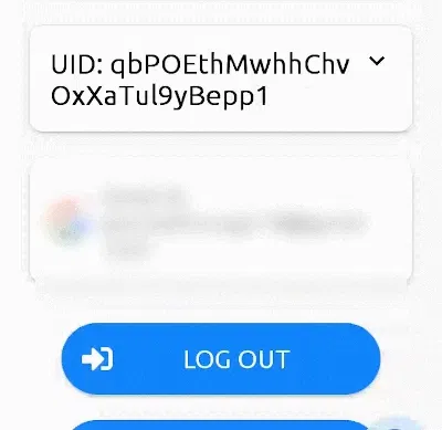
Conclusion
You’ve learned a way to add accordions to your app. Here’s a demo of what it will look like in your app.
I hope you enjoyed the article and it helped you!
What did you learn from this tutorial? Comment and let me know! 🙂


 Array Initialization")
