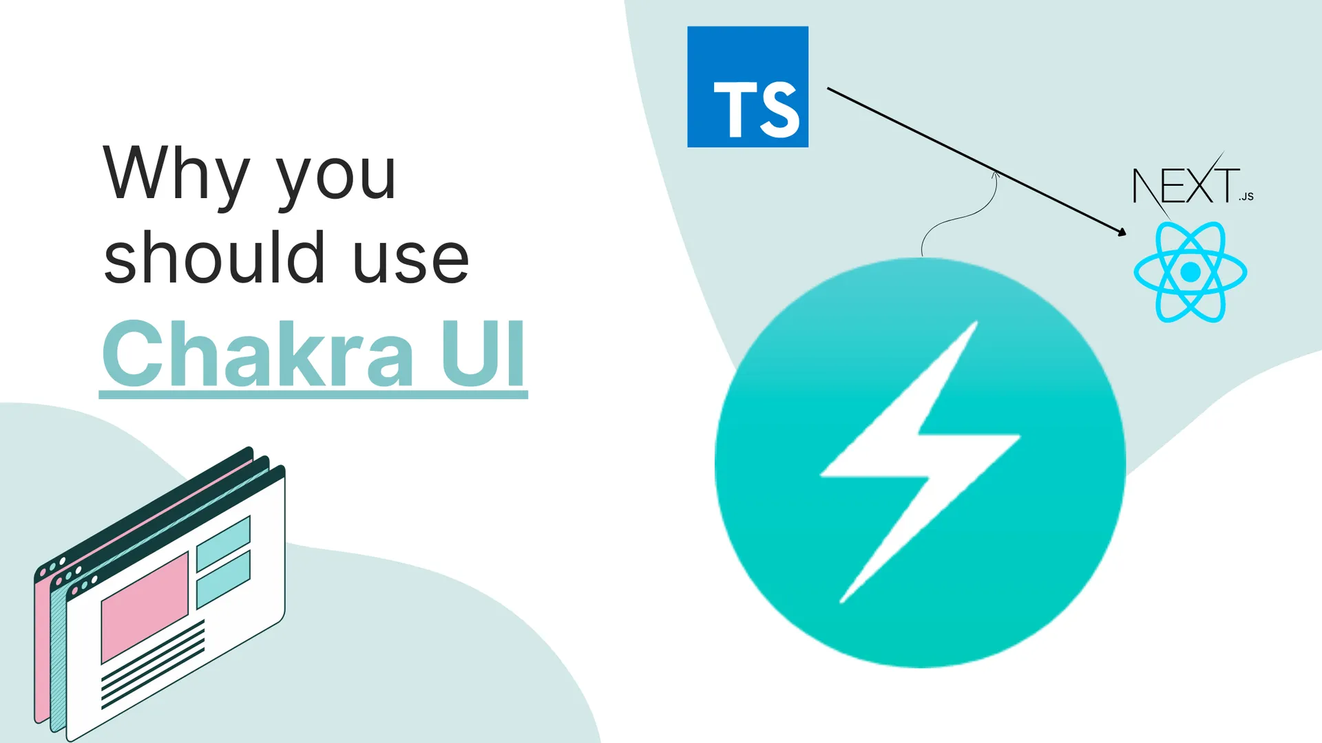

Chakra UI is an absolutely amazing UI library built for React. It consists of a plethora of components that you can use as building blocks for a beautiful and responsive front end. In this article, I’m gonna go over its selling features and how it compares to one of its key alternatives- Tailwind CSS.
Why should you use Chakra UI?
The reason I started using Chakra UI was because of a few really fundamental features that Chakra offers:
1. Easy Dark/Light Mode
Chakra offers a design system built for both light and dark modes and a seamless way of transitioning between them. Take a look at this bit of code:
function Example() {
  const { colorMode, toggleColorMode } = useColorMode()
  return (
    <header>
      <Button onClick={toggleColorMode}>
        Toggle {colorMode === 'light' ? 'Dark' : 'Light'}
      </Button>
    </header>
  )
}
That’s it! It’s very easy to set up, and everything you require to get started with it is all mentioned elaborately in their documentation.
It’s also easy to switch between colors based on light and dark mode as illustrated below:
function StyleColorMode() {
  const { toggleColorMode } = useColorMode()

  const bg = useColorModeValue('red.500', 'red.200')
  const color = useColorModeValue('white', 'gray.800')

  return (
    <>
      <Box mb={4} bg={bg} color={color}>
        This box's style will change based on the color mode.
      </Box>
      <Button size='sm' onClick={toggleColorMode}>
        Toggle Mode
      </Button>
    </>
  )
}
Here the value of bg will be red.500 in light mode and red.200 in dark mode. This system allows for easy modification of the UI based on the color mode.
2. Colors
Chakra has a huge set of colors with varying accents, which is inspired by Tailwind’s colors.
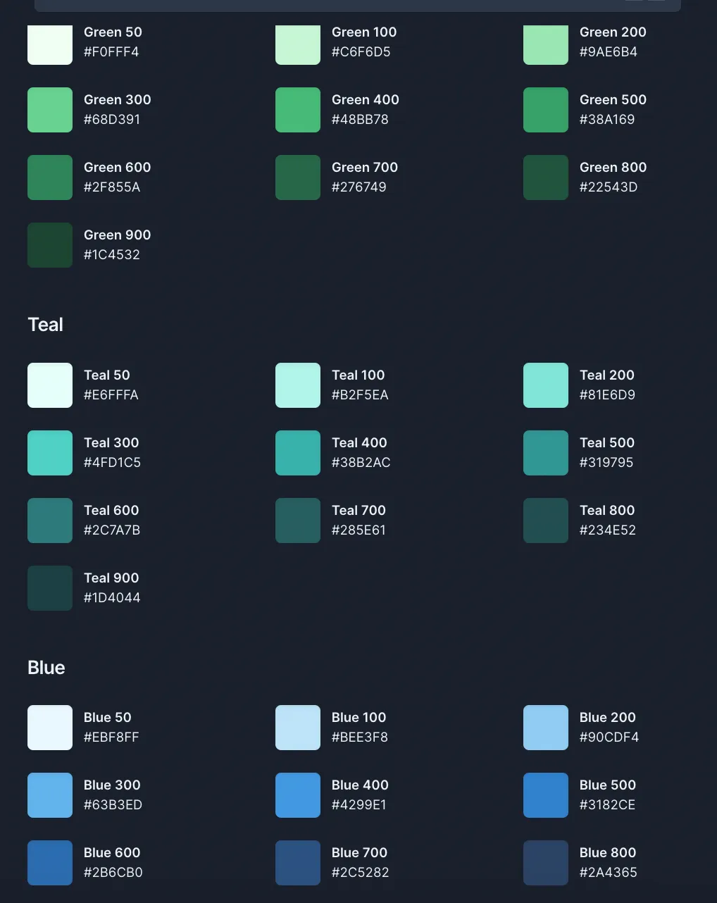
Chakra also makes it very easy to create custom gradients using linear, radial, and other CSS gradient types.
<Box w='100%' h='200px' bgGradient='linear(to-r, green.200, pink.500)' />
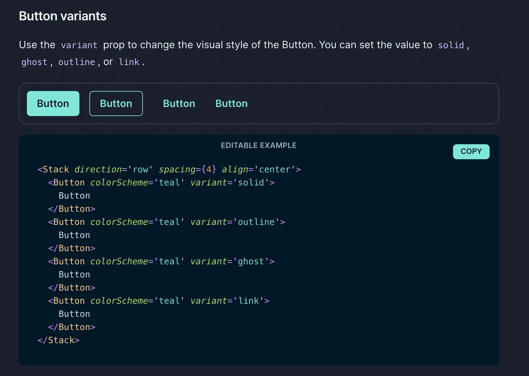
3. Utility-based Components
Chakra has a lot of components for almost everything you would need to build a front-end. Coming from a guy who has nearly zero proficiency with CSS and designing in general, Chakra is a life-saver. I mean, they have a component for freaking centering stuff.
<Center bg='tomato' h='100px' color='white'>
  This is the Center
</Center>
Just stick Center everywhere. How cool is that 😭
Another component that I find really useful is the Box component. It’s like a div on steroids. It can easily be sized and made responsive.
The SimpleGrid component is also really, really cool. These can also be made auto-responsive using the minChildWidth property.
// Passing `columns={[2, null, 3]}` and `columns={{sm: 2, md: 3}}`
// will have the same effect.

<SimpleGrid columns={[2, null, 3]} spacing='40px'>
  <Box bg='tomato' height='80px'></Box>
  <Box bg='tomato' height='80px'></Box>
  <Box bg='tomato' height='80px'></Box>
  <Box bg='tomato' height='80px'></Box>
  <Box bg='tomato' height='80px'></Box>
</SimpleGrid>
There is also the Stack component with variants like HStack and VStack which are also extremely useful while arranging multiple UI elements.
<HStack spacing='24px'>
  <Box w='40px' h='40px' bg='yellow.200'>
    1
  </Box>
  <Box w='40px' h='40px' bg='tomato'>
    2
  </Box>
  <Box w='40px' h='40px' bg='pink.100'>
    3
  </Box>
</HStack>
Chakra’s modal, alert and popover components are also very nice.
4. Styling
You can easily style and customize Chakra components by using style props:
import { Box } from "@chakra-ui/react"

// m={2} refers to the value of `theme.space[2]`
<Box m={2}>Tomato</Box>

// You can also use custom values
<Box maxW="960px" mx="auto" />

// sets margin `8px` on all viewports and `12px` from the first breakpoint and up
<Box m={[2, 3]} />

// picks up a nested color value using dot notation
// => `theme.colors.gray[50]`
<Box color='gray.50' />

// raw CSS color value
<Box color='#f00' />

// background colors
<Box bg='tomato' />

// verbose prop
<Box backgroundColor='tomato' />
There are also various shorthands you can use to style faster like mt for margin-top, w for width, h for height, etc.
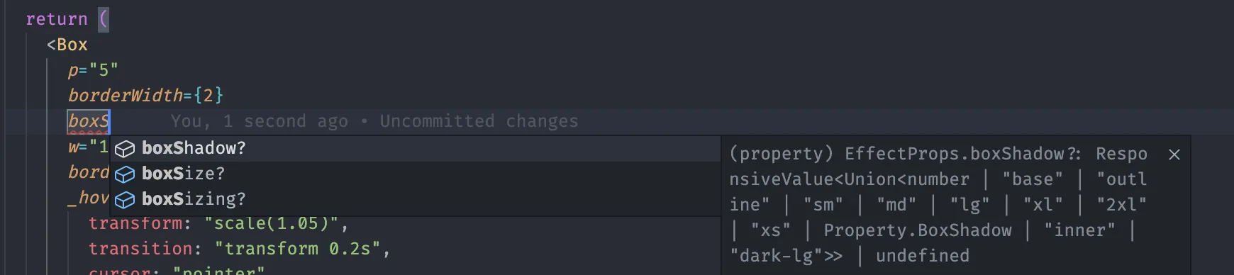
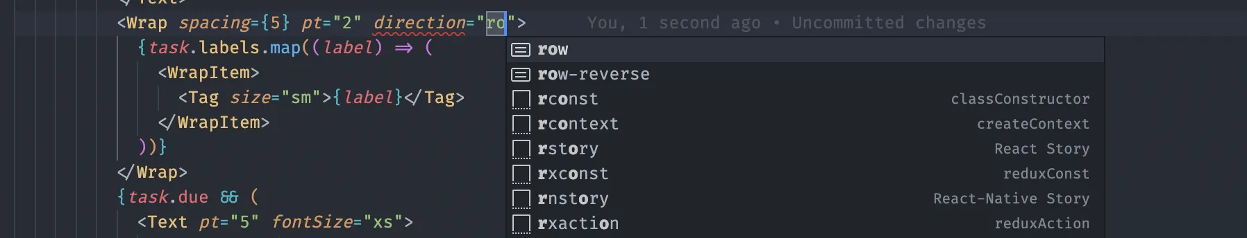
5. Complete TypeScript support
I’m a complete TypeScript simp and Chakra comes with built-in type definitions so it has great autocomplete in VSCode and other such editors.
6. Responsive styles
Chakra UI also comes with responsive styles out of the box, where you can use objects and array values to provide specific styles for different breakpoints, which in my opinion is way cleaner than using media queries.
<Box bg='red.200' w={[300, 400, 500]}>
  This is a box
</Box>
7. Customization
The default color theme can be changed by extending the main theme object and you can also modify other Chakra components like the Button etc.
8. Documentation
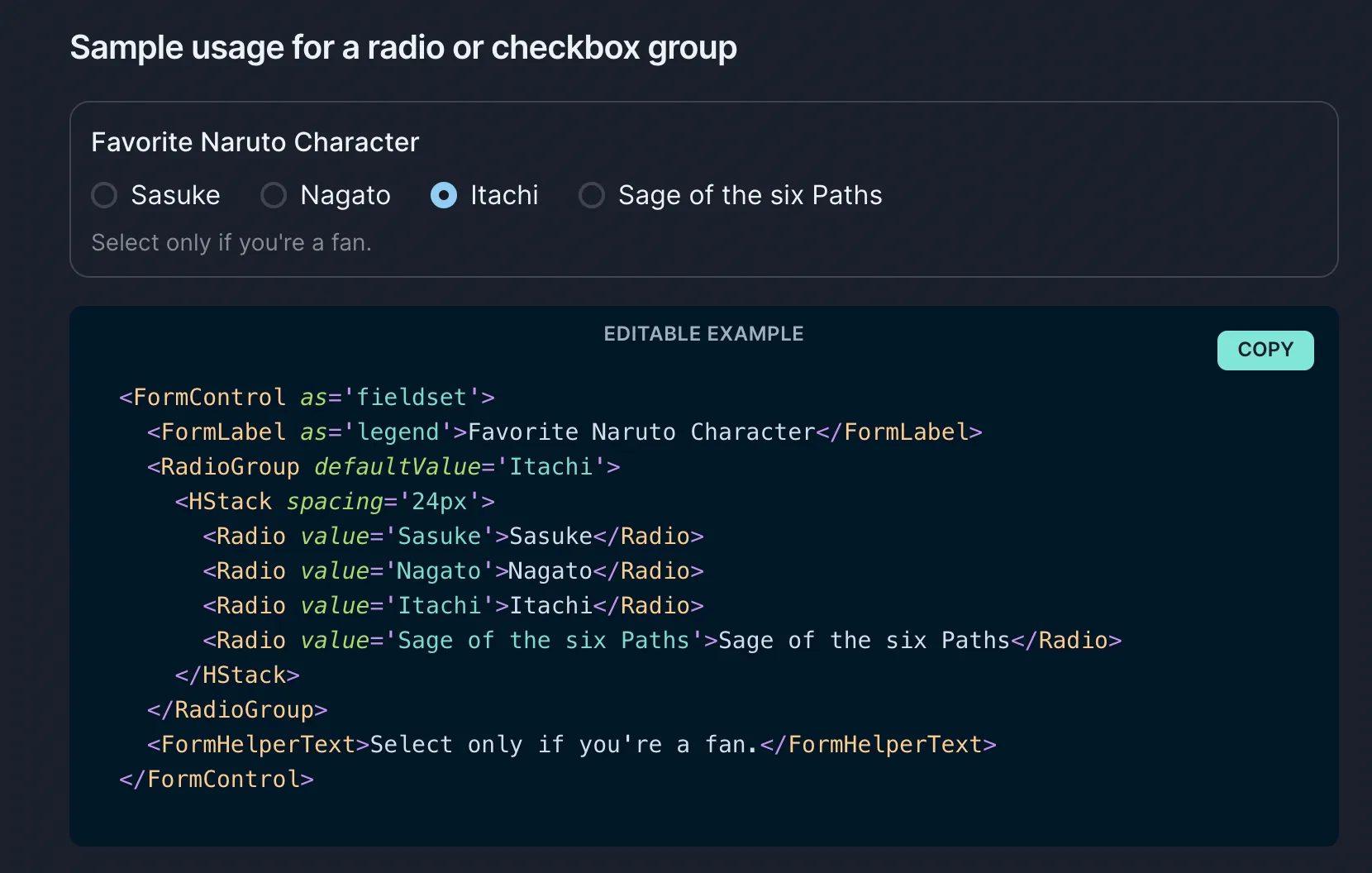
The documentation for Chakra UI is thorough and easy to understand, with everything you could possibly need during development. It has editable examples which are really useful to do some quick tinkering.
In fact, I barely remember having to google anything while working with Chakra since everything was in the docs.
Chakra UI vs Tailwind
Tailwind focuses on styling, which means you’ll have to handle a lot of stuff like accessibility, keyboard navigation, etc. Meanwhile, Chakra focuses more on being a UI library, with all the styling and other related functionality taken care of.
But this means that you will obviously be losing out on customization when compared to Tailwind, but I am fine with that.
Writing responsive styles and styling, in general, is pretty similar to vanilla CSS, which I don’t like, but many love the simplicity of Tailwind.
Tailwind can be used with other frameworks like Angular, Vue, Svelte, etc., but Chakra only has support for React and other React-based libraries like Next, Redwood, Remix, etc.
Personally, I prefer using Chakra UI as it’s easier to use with its in-built components rather than styling them all myself. And I know Tailwind UI exists, but again it doesn’t really focus on the functional aspect of things.
A more detailed comparison for Tailwind and other libraries like Material UI and Ant Design can be found in their docs.
The End
I hope this article has convinced you to try out Chakra ;) Btw, I am NOT sponsored by them in any way, I just feel it’s a really awesome tool so if you do like it, please do drop a star in their Github repo.
That’s it, folks, see you in another one!


![Android Jetpack DataStore Tutorial 2025 [Kotlin Generics Way]](https://ik.imagekit.io/genicsblog/tr:w-1920,h-1080,f-webp/https://i.ytimg.com/vi_webp/1zXwaySv2JM/maxresdefault.webp "Android Jetpack DataStore Tutorial 2025 [Kotlin Generics Way]")

